view our featured work. or, view work by:
the watsons

we’re the watsons.
we specialize in advertising, advocating, anxiety-relieving, asking, branding, challenging, cost-saving, designing, digging, listening, pivoting, & supporting.
we’re fond of small type, big pours, and dogs of all sizes.

WATSNEW


filter: featured work.

the work.

nyc public markets

as both foodies and new yorkers, we were beyond happy to shine a light on new york city public markets — thriving celebrations of the diverse communities and cuisine of the city we love.

NYCEDC_phone_kiosk_A_web.jpg

new york city public markets were born when mayor fiorello la guardia fought to keep food affordable for new yorkers and to provide indoor space for the city’s growing population of street vendors in the midst of the great depression. today, the key markets include essex market in the lower east side, la marqueta in harlem, arthur avenue in the bronx, moore street market in east williamsburg, 13th avenue retail market in borough park, and jamaica market in queens. and we watsons have created a new master brand, shining a bright new light on their vibrant past, present—and future!

per the nycedc vice president of retail markets, “the vibrant new branding and campaign for new york city public markets aim to increase visibility and raise awareness of these vital community and cultural hubs for affordable, healthy, and diverse food. we are proud to be launching these resources to provide crucial support to our small businesses who might otherwise find it difficult to open and operate in a prime retail location in the city or invest in marketing and promotional resources.”

NYCEDC_mailer_web.jpg
publicmarkets_logo.png

per the nycedc vice president of retail markets, “the vibrant new branding and campaign for new york city public markets aim to increase visibility and raise awareness of these vital community and cultural hubs for affordable, healthy, and diverse food. we are proud to be launching these resources to provide crucial support our small businesses who might otherwise find it difficult to open and operate in a prime retail location in the city or invest in marketing and promotional resources.”

NYCEDC_comp_home_laptop_web.jpg

the new website houses all of the markets in a bright, colorful design that extend the brand personality introduced with the new logo. the site promotes the nyc public markets master brand, while allowing the individual market brands to shine in their individual ways—complete with vendor lists and profiles.

the site takes users to market to experience the people, food, and events each has to offer. using immersive, full-width photos of people from all walks of life in the markets, carrying their bounty, our messaging speaks to heritage, tradition and city pride in an accessible tone that’s decidedly nyc.

last, but not least, our new, multi-lingual out-of-home, print and digital campaign—punctuated with a new tagline—shines a light on the wondrous finds contained within each market—and the promise of exciting things to come: good things are in store.
 
NYCEDC_phone_kiosk_B_web.jpg
NYCEDC_linknyc_A_web.jpg
whole foods market

they were our oz. doers of good, worth the journey, and very, very green. they made us more passionate, intelligent, and courageous about our food. and they believed in the watsons. and so it was that we began a partnership with not one, not two, but three regions of whole foods market — and did a whole bunch of work that put us on the map.

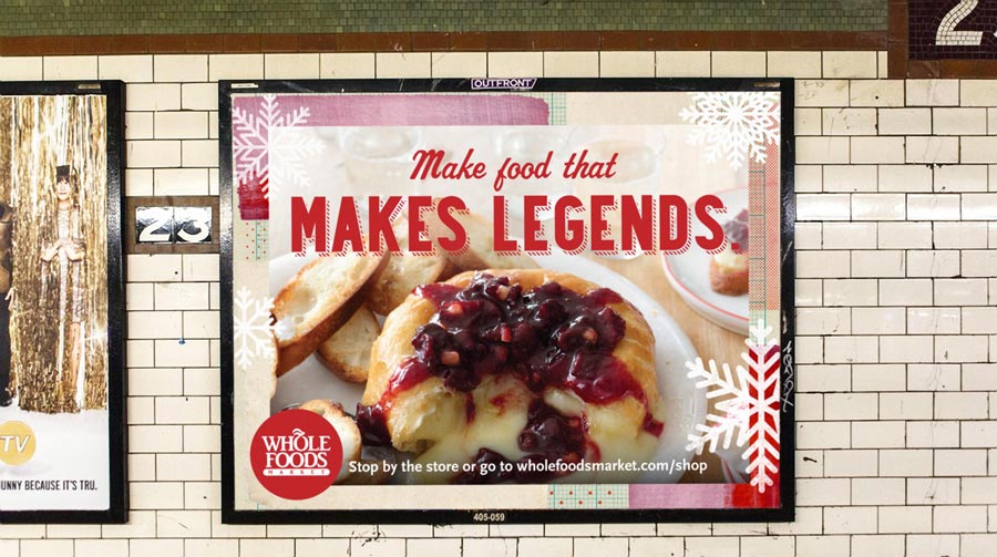
adv_wholefoodsmarket_subway_1sheet.jpg
adv_wholefoodsmarket_timessquare_inmedia.jpg
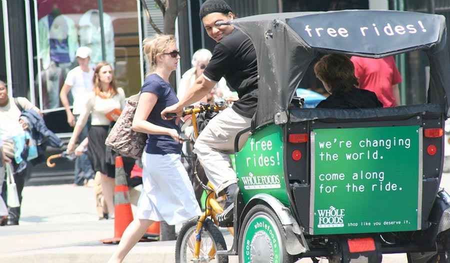
adv_wholefoodsmarket_pedicab.jpg

when gotham became the emerald city.

using urban streets as our landscape, including billboards, in-store signage, train posters, and pedicabs, we set out to reach people where they live — and shop. 

we painted the town whole foods green with disruptive, whimsical messaging as pure and honest as the brand’s offerings.  with short, quippy lines that were quick and easy to read, we drove our messaging home to even the busiest passersby. we made them smile. we made them think, and, most of all, we reminded them what value really means. the stunning green designs jumped off of every medium, creating a look that was both conspicuous and beautiful. and the tagline summed up every message with a call to action: shop like you deserve it.™

the watsons took over times square, covering sidewalks with bio-friendly stenciling for new yorkers who had a pre-smartphone penchant for looking down. and we branded pedicabs, giving shoppers who spent over $50 on groceries, free rides home. we also ran the campaign on food blogs and nyc-centric sites.

the results? whole foods’ tribeca store experienced the brand’s biggest opening, messaging was adopted by the mid-atlantic region, they received press coverage for the campaign and pedi-cabs, and there was an increase in basket size among all existing stores in the region.

featured_wholefoodsmarket_subway_entrance.jpg
featured_wholefoodsmarket_bag.jpg

we had the next campaign on the bag.

next, we reached into our bag of tricks for something special. and as it turned out, the bag was all we needed. there’s no better proof of promise than a person with a bag full of groceries, so we shot consumers with bags featuring messages about value and quality. the campaign was seen on out of home that reached audiences where they lived, worked and walked in new jersey and manhattan. and, with life imitating art, the campaign was such a hit whole foods decided to feature the campaign's headlines on the bags they provide to their customers upon checkout – thus creating thousands of walking billboards all around town.

the campaign was such a success that it made its way to the windy city. having recently opened their third largest store in the world, we adapted the ooh campaign, shooting at iconic locations like the fullerton street el stop and the biograph theater. the new campaign converted chi-town shoppers into living, breathing testimonials.

adv_wholefoodsmarket_subway_2sheet.jpg

helping new yorkers stay prepared.

to raise the profile of their holiday prepared food offerings, the watsons created a campaign for the northeast that included out of home, digital and print in time out new york.

featured_wholefoodsmarket_cheese_app-850.jpg

APPetizing cheese.

does asiago go with honey or jam? is it best to get a semi-soft, mild, or a sharp spreadable? and did you know that to make a proper cheese board you need to have 4 different types of cheese? we teamed up with whole foods market’s mid-atlantic team to design an app that let’s you know exactly what kind of cheese you need based on pairings, texture, and type. 

users could customize their own cheese boards or shake the app for a handcrafted board from the brand’s amazing cheesemongers. it even featured cheese profiles for 72 cheeses. pairings could be shared on social, and users entered to win yummy, cheesy prizes. now, that’s something to smile about. 

doing their share over the holidays.

we created a tv campaign for whole foods’ midwest that brought back the kinder, gentler spirit of the holidays. the three heartwarming tales proved that sharing really is caring. handling concept, writing, producing, and editing — we and our incredible cast and crew (and very cool client) helped whole foods market spread some powerful holiday cheer.

grand central terminal

when we were named agency of record for grand central terminal in 2012, it was the beginning of a beautiful partnership. what could be better than using our watson wattage to shine a light on the 60 shops and 35 dining options that make the terminal a favorite destination? for us, in the grand scheme of things, it was the grandest.

branding_grandcentral_logointerior.jpg

a new logo for a century-old icon.

when the fine folks at grand central asked us to design a new logo, we endeavored to create an elegant blend of classic and modern—much like the terminal itself. an exploration of the original architecture led us to a mark that had been part of the building since its opening in 1913. 

the circular marble relief was a monogram with the letters “g”, “c”, and “t”. so, we partnered with type artist bryan patrick todd to artfully transform it into the elegant, new monogram—one that organically translates to a digital version.

the biggest influences for the new monogram came directly from the circular forms found around the building: the exposed lightbulbs of the beaux-arts chandeliers, and faces on both the info booth and famed tiffany clocks. and in an ‘easter egg’ nod to grand central’s railroad history—enthusiasts will notice that the spike in the letter “g” echoes the shape of a train spike used along the tracks.

the new grand central logo font, sackers gothic was inspired by engravers fonts popularized in the early 20th century. the font’s simple, all-capital forms reference that period, while the sans serif typeface imbues the logo with modernity.

it’s a classic case of everything old being new again. and a dream project we never dreamed possible!

featured_grandcentral_outofhome_advertising.jpg

advertising 60 shops and 35 dining options under one magnificent roof.

it was a big job, and the watsons were thrilled to do it. we, along with some of the city’s finest retail and architectural photographers, shot all the edible and shop-able reasons why locals and tourists come to grand central terminal. and let us tell you, there are many of them, each as amazing as they are photogenic. 

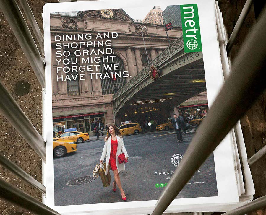
from shake shack to grand central market and vineyard vines to tumi, each picture paints a thousand wows. the snaps were used in collateral and in ads on city kiosks, station and interior posters, metro wraps, time out new york, and in digital.

adv_grandcentral_printad.jpg
digital_grandcentralterminal_Shop&Dine_iphone_850.jpg
featured_grandcentral_holiday_fair_sign.jpg

branding the grandest of events.

though some would argue that every day is an event at grand central, there are some special occasions that bring in the masses and create traditions for families and friends alike. whether it’s a centennial celebration marking grand central’ milestones, or the annual holiday fair, film festival, taste of the terminal, or summer sendoff — there really is something for everyone all year round.

web_grand_central_timeline_01.jpg

lights. camera. action. the videos of grand central.

there’s no better way to bring grand central to the masses than through the power of film. the watsons created a number of video series that give audiences an inside look at the people and places that make this an unrivaled destination. from chef portraits to tours of grand central’s best kept secrets, they’re the next best thing to being there.

fresh&co

so this really smart restaurant concept, with great food — ditto people — comes knocking with an opportunity to take their brand from burgeon to boom. we do the work, make the pitch, and are named agency of record (not-so-humble brag: we also got a standing o). and just like that, we hit the ground running with a soup-to-nuts rebrand. make that, a curried lentil with kale soup-to-blended nuts rebrand. delicious! 

package_fresh&co_cups_bags_1_web.jpg

fresh&new.

when we met fresh&co, a breakthrough, healthy, quick service restaurant concept, they had four locations in nyc. today, they have sixteen in a marketplace now saturated with copycat concepts. our role? we rebranded the restaurants inside and out — complete with wall murals, menu boards, signage, window clings, uniforms, and food packaging. and for good measure, we named the meals.

bringing to light the concept’s making everything to order and using only fresh ingredients, we began with the tagline: just made. just for you.™

adv_fresh&co_phone_kiosk.jpg
adv_fresh&co_register_screen.jpg

a new design is in the system.

to ensure continuity across all touchpoints, we created a design system that elevated the brand’s profile and personality. using a playful suite of icons, including farm elements, foods, expressions, and culinary instruments — and messaging that reflected the whimsy of the design, we created a fun, accessible energy. using a white envelope to bring home the modernity of the brand, we juxtaposed hand-cut typography and design elements to create the perfect rustic/contemporary balance for the brand, bringing home its culinarily-innovative, locally-sourced menu offerings.

featured_fresh&co_store_interior.jpg
featured_fresh&co_food_image.jpg

swag, social, and making a scene.

over the years, we developed team uniforms, ambient campaigns featuring a branded tractor showing up on nyc streets, and swag for earth day, green markets, store openings, and other events. for example, when fresh&co opened near nyu, we put together an integrated strategy that included opening day postcards, swag, digital, and social ad campaigns for students. fresh&co hosted pre-opening parties and sidewalk tastings, and we suggested the restaurant remain open for 24 hours during finals week. — a caffeine-laced hit!

featured_fresh&co_swag_grid_images_2500x2500.jpg